
Recommended
More Related Content
What's hot
What's hot (20)
Similar to Evaluation question 2
Similar to Evaluation question 2 (20)
Evaluation question 2
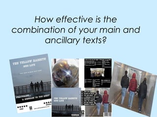
- 1. How effective is the combination of your main and ancillary texts?
- 2. How have you connected all three of your products? All three of our products are connected as all the same locations are used in the video as well as the pictures which are included in the digi-pack and the magazine advertisement. For example the bridge that the boys are on in this picture is used at the end of the music video, it symbolises where the boys end up. This picture is also used on our digi –pack, this creates synergy as this bridge picture is well known to our target audience. Also the same four characters that are seen in the start of the video are seen at the end of the video, this also creates synergy as the audience will recognise these characters.
- 3. We also created synergy by using the same font and colour of font in Synergy both our ancillary tasks. This font is also big and bold and easily recognised. Here is the font we used in both our ancillary tasks.
- 4. What do your ancillary texts add to your main text? • The magazine advert makes the music video look good, it does this by the use of a five star rating at the bottom showing to the target audience that it would be worth buying. • The digi – pack gives the music video a professional outlook. As the same locations and pictures and characters are used in all three products, giving the audience a clear idea of what they are going to be buying. • The lyrics inside the digi pack could add enjoyment for an audience. With the contribution of the pictures of the people in the music video, it gives the audience more of an idea about the band they are listening to.
- 5. Feelings about the final products... Overall I am pleased with our final products. I feel that they all link well together. However, to improve I think we could have used more locations in our music video and also create more of a narrative and a story for our music video, and shots that explained the lyrics of the song a bit better. Also, according to our audience feedback the font used in our magazine advert and digi-pack was not appealing, however we felt that this font added to the vintage style of all three of our products and that it was bold and clear and made our product stand out and unique.
- 6. Feelings about the final products... Overall I am pleased with our final products. I feel that they all link well together. However, to improve I think we could have used more locations in our music video and also create more of a narrative and a story for our music video, and shots that explained the lyrics of the song a bit better. Also, according to our audience feedback the font used in our magazine advert and digi-pack was not appealing, however we felt that this font added to the vintage style of all three of our products and that it was bold and clear and made our product stand out and unique.